How does a country’s wealth relate to the health of its population? This report examines the cross-country relationship between income and life expectancy using data from the gapminder package. The relationship between income and life expectancy was first systematically documented by Preston (1975), who showed that richer countries tend to have substantially longer life expectancy — a pattern now known as the Preston curve.
Understanding this relationship matters for international business: companies expanding into lower-income markets face very different consumer health profiles, healthcare costs, and workforce productivity than those operating in wealthy economies.
2 Data
The analysis uses data from the gapminder package (Békés and Kézdi 2021), which provides information on GDP per capita, life expectancy, and population for 142 countries observed at five-year intervals from 1952 to 2007. We focus on the 2007 cross-section — the most recent year in the dataset — to examine the contemporary income–health relationship.
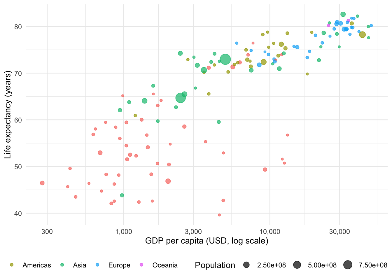
Figure 1: GDP per capita and life expectancy across countries (2007). Bubble size reflects population size.
Figure 1 shows a clear positive association: countries with higher GDP per capita tend to have longer life expectancy. The x-axis uses a log scale because GDP per capita varies enormously across countries — on a log scale, equal distances represent equal percentage differences, which makes the comparison more meaningful.
African countries (red) cluster in the lower-left quadrant — lower income and shorter life expectancy — while European and Oceanian countries dominate the upper-right. Asia shows the most heterogeneity: countries like Japan sit near the top, while several lower-income Asian nations fall much lower. The relationship is not perfectly tight: some countries have higher life expectancy than their income level alone would predict, reflecting differences in health systems, diet, and geography.
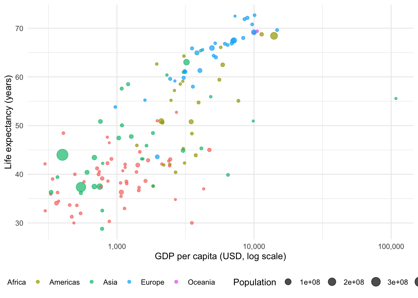
Figure 2: GDP per capita and life expectancy across countries (1952). Compare with Figure 1 to see how the relationship has changed.
Figure 2 shows the same relationship in 1952. Comparing the two figures, several patterns stand out. First, life expectancy has risen substantially in all regions — the entire cloud of points has shifted upward. Second, the spread across countries has narrowed: in 1952 many countries had life expectancies below 40 years; by 2007 very few do. Third, the positive income–health association was already present in 1952, suggesting it is a persistent structural feature rather than a recent development.
4 References
Békés, G. and Kézdi, G. (2021) Data analysis for business, economics, and policy, Cambridge University Press, available at https://gabors-data-analysis.com.