Code
co2_data <- read_csv(here("content/material/session01/data/wdi_co2_gdp_pop.csv"))A short analytical report
Do richer countries pollute more? At first glance, the answer seems obvious: higher incomes mean more factories, more cars, more flights. But the reality is more nuanced. Some of the world’s largest emitters are middle-income countries with enormous populations, while several wealthy nations have managed to decouple economic growth from emissions growth.
In this report, we explore the cross-country relationship between economic output and CO2 emissions using recent data from the World Bank. The central question is: how closely does a country’s income level predict its CO2 footprint — and does population size explain the pattern?
Understanding this relationship matters for international business: companies operating across borders face very different regulatory environments and carbon cost structures depending on where a country sits in the income-emissions space.
We use panel data covering the period 2020–2024 for all countries for which complete data are available. The three key variables are:
The data were downloaded from the World Bank World Development Indicators using the WDI R package (Arel-Bundock 2024) and are stored locally in data/wdi_co2_gdp_pop.csv. To reproduce the download, run fetch_data.R in this session’s folder.
co2_data <- read_csv(here("content/material/session01/data/wdi_co2_gdp_pop.csv"))For the main visualisation, we average each variable across all available years per country. This smooths out year-to-year fluctuations and gives a more stable cross-country picture.
co2_avg <- co2_data |>
  group_by(country, iso2c, iso3c) |>
  summarise(
    across(c(co2_mt, gdp_ppp, pop, gdp_pc_ppp, co2_pc_t), mean),
    years_n = n(),          # how many years contributed to each average
    .groups = "drop"
  ) |>
filter(pop >= 1e6) # drop micro-states (< 1 million inhabitants)# Highlight a selection of named countries for orientation
label_countries <- c(
"United States", "China", "India", "Germany",
"Brazil", "Nigeria", "Norway", "Saudi Arabia", "Indonesia"
)
ggplot(
co2_avg,
aes(x = gdp_pc_ppp, y = co2_pc_t, size = pop, label = country)
) +
geom_point(alpha = 0.5, colour = "#00395B") +
geom_smooth(method = "lm", se = FALSE, color = "#69aacd", show.legend = FALSE) +
geom_text_repel(
data = co2_avg |> filter(country %in% label_countries),
size = 3, colour = "#444444", max.overlaps = Inf,
show.legend = FALSE
) +
scale_x_log10(labels = scales::label_dollar(scale = 1/1000, suffix = "k")) +
scale_y_log10(labels = scales::label_comma(suffix = " t")) +
scale_size_continuous(
range = c(1, 18),
labels = scales::label_comma(scale = 1/1e6, suffix = "M")
) +
labs(
x = "GDP per capita (log scale, USD PPP)",
y = "CO2 per capita (log scale, metric tons)",
size = "Population",
title = "Richer countries tend to emit more CO2 per person",
subtitle = "But population size shapes total emissions — note China and India"
)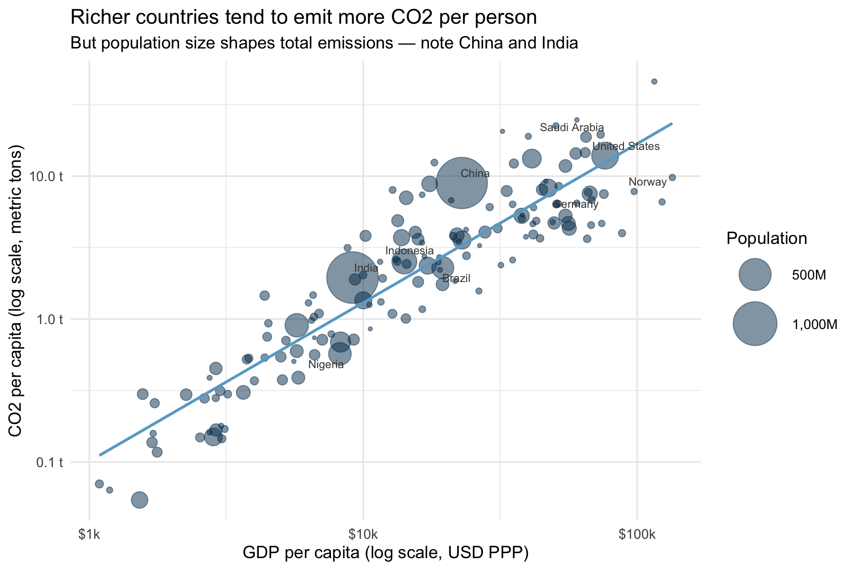
Figure 1 reveals a clear positive association: countries with higher GDP per capita also tend to have higher CO2 emissions per person. Both axes use a log scale — this is important when variables span several orders of magnitude, as both income and emissions do. On a log scale, equal distances represent equal percentage differences, which makes cross-country comparisons more meaningful.
Notice that the relationship is not perfectly tight. Some high-income countries (e.g. Norway) emit substantially less than their income level would predict — reflecting a combination of renewable energy, mild climate, and policy choices. Conversely, some oil-producing economies emit far more than their income alone would suggest.
The bubble size encodes population, which drives a wedge between per-capita and total emissions. China and India, for example, sit at moderate income and emissions per capita, but their enormous populations make them among the world’s largest total emitters.
# Both variables already transformed in the data; log-transform here for the model
co2_model <- co2_avg |>
  mutate(
    log_co2_pc  = log(co2_pc_t),
    log_gdp_pc  = log(gdp_pc_ppp)
  )

model <- lm(log_co2_pc ~ log_gdp_pc, data = co2_model)

modelsummary(
  model,
  stars   = TRUE,
  gof_map = c("nobs", "r.squared"),
  coef_rename = c(
    "(Intercept)" = "Intercept",
    "log_gdp_pc"  = "Log GDP per capita"
  )
)| (1) | |
|---|---|
| + p < 0.1, * p < 0.05, ** p < 0.01, *** p < 0.001 | |
| Intercept | -9.972*** |
| (0.404) | |
| Log GDP per capita | 1.112*** |
| (0.042) | |
| Num.Obs. | 149 |
| R2 | 0.828 |
When both variables are log-transformed, the coefficient has a convenient interpretation: a 1% increase in GDP per capita is associated with on average a 1.11% change in CO2 per capita, on average. This is an elasticity — a concept we return to in Session 2.
A simple cross-country regression confirms a strong positive relationship between income and CO2 emissions per capita. Yet income explains only part of the story: the residual variation reflects differences in energy mix, industrial structure, climate policy, and geography. Unpacking these patterns — and distinguishing correlation from causation — requires the tools we develop across the rest of this course.